最新老外的标准雅思小作文范文(分享)资料

老外写的小作文范文,比较直观~~
第一篇
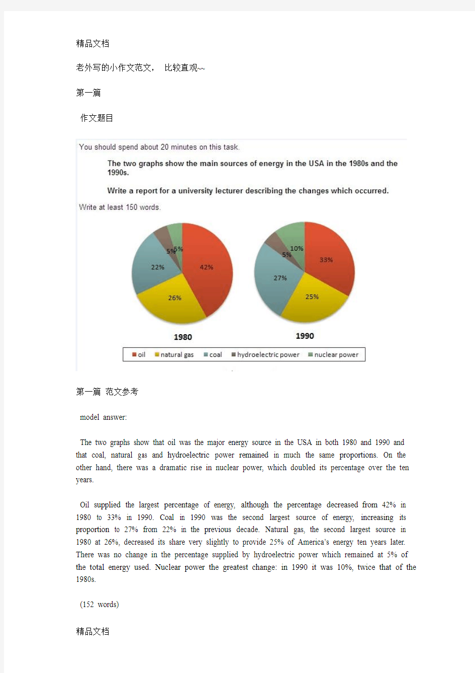
作文题目
第一篇范文参考
model answer:
The two graphs show that oil was the major energy source in the USA in both 1980 and 1990 and that coal, natural gas and hydroelectric power remained in much the same proportions. On the other hand, there was a dramatic rise in nuclear power, which doubled its percentage over the ten years.
Oil supplied the largest percentage of energy, although the percentage decreased from 42% in 1980 to 33% in 1990. Coal in 1990 was the second largest source of energy, increasing its proportion to 27% from 22% in the previous decade. Natural gas, the second largest source in 1980 at 26%, decreased its share very slightly to provide 25% of America’s energy ten years later. There was no change in the percentage supplied by hydroelectric power which remained at 5% of the total energy used. Nuclear power the greatest change: in 1990 it was 10%, twice that of the 1980s.
(152 words)
第二篇
第二篇答案参考
model answer:
The three graphs of wheat exports each show a quite different pattern between 1985 and 1990. Exports from Australia declined over the five-year period, while the Canadian market fluctuated considerably, and the European Community showed an increase.
In 1985, Australia exported about 15 millions of tonnes of wheat and the following year the number increased by one million tonnes to 16 million. After that, however, there was a gradual decline until 1989 and 1990 when it stabilised at about 11 million tonnes. Over the same period, the amount of Canadian exports varied greatly. It started at 19 million tonnes in 1985, reached a peak in 1988 of 24 million, dropped dramatically in 1989 to 14 million tonnes and then climbed back to 19 million in 1990. Seventeen million tonnes were exported from the European Community in 1985, but this decreased to 14 million tonnes in 1986 and then rose to 15 million in 1987 and 1988 before increasing once more to 20 million in 1990.
(165 words)
第三篇(流程图哦,必看必看)
You should spend about 20 minutes on this task.
The flowchart illustrates the production of coloured plastic paper clips in a small factory.
Write a report for a university tutor describing the production process.
第三篇model answer
There are four main stages in the production of plastic paper clips from this small factory. Two of these stages involve actual preparation of the clips, while the other two consist of quality control before the clips are sent out from the factory to the retailers to be sold to the public.
To begin with, molten plastic is poured into three different moulds depending on the colour required; the colours are red, blue and yellow. Once these clips emerge from the moulds a quality control machine checks them for strength. Unsatisfactory clips are rejected. In the third stage in the process the clips are stored by hand into two groups, mixed and single colours. When this stage is complete the groups are checked a second time to ensure that the colour mixtures are divided correctly into single colours and mixed colour batches. Finally, the clips are packed and dispatched to the markets.
(152 words)
第四篇表格题
You should spend about 20 minutes on this task.
The table below give information about Favorite Pastimes in different countries.
Summarise the information by selecting and reporting the main features, and make comparisons where relevant.
Write at least 150 words.
第四篇参考答案
model answer:
This table clearly presents and compares favorable pastimes in eight different countries. The pastimes, across the top of the table, are analyzed in relation to each country.
As can be seen, about 60% of Canadians, Australians and Americans like watching television. On the other hand, this figure is quite low for China where only 15% of people watch television. Predictably, Americans like music at 23%, whereas only 2 to 5% of people in the other countries feel the same way. 20% of people in England enjoy sleeping as a pastime whereas in Canada and the USA, for example, the figure is only 2%. Interestingly, the Chinese like hobbies the most at 50%, as opposed to only 20% in France. It isn’t surprising that the highest percentage of beach-lovers is in Australia and the USA at 30%.
It seems that pastimes of people of different nationalities may be influenced by a number of factors such as the socio-economic situation or the climate. These factors influence cultural differences between different nationalities and make cross-cultural experiences more interesting.
(175 words)
You should spend about 20 minutes on this task.
Write a report for a university lecturer describing the information shown below.
You should write at least 150 words.
第五篇参考答案
In this analysis we will examine three pie charts. The first one is headed ‘World Spending.’ The second is ‘World Population’ and the third is ‘Consumption of Resources.’
In the first chart we can see that people spend most of their income (24%) on food. In some countries this percentage would obviously be much higher. Transport and then housing are the next major expenses at 18% and 12% respectively. Only 6% of income is spent on clothing.
In the second chart entitled ‘World Population’, it is not surprising to find that 57% of people live in Asia. In fact China and India are two of the most populated countries in the world and they are both situated on this continent. Europe and the Americans account for nearly 30% of the total, whilst 10% of people live in Africa.
Finally, the third chart reveals that the USA and Europe consume a huge 60% of the world’s resource.
To sum up, the major expenditure is on food, the population figures are the highest for Asia and the major consumers are the USA and Europe.
(182 words)
You should spend about 20 minutes on this task.
The graph and table below give information about water use worldwide and water consumption in two different countries.
Summarise the information by selecting and reporting the main features, and make comparisons where relevant.
Write at least 150 words
第六篇参考答案
model answer:
The graph shows how the amount of water used worldwide changed between 1900 and 2000.
Throughout the century, the largest quantity of water was used for agricultural Purposes, and this increased dramatically from about 500 km3 to around 3,000 km3 in the year 2000. Water used in the industrial and domestic sectors also increased, but consumption was minimal until mid-century. From 1950 onwards, industrial use grew steadily to just over 1,000 km3, while domestic use rose more slowly to only 300 km3, both far below the levels of consumption by agriculture.
The table illustrates the differences in agriculture consumption in some areas of the world by contrasting the amount of irrigated land in Brazil (26,500 km3) with that in the D.R.C. (100 km2). This means that a huge amount of water is used in agriculture in Brazil, and this is reflected in the
figures for water consumption per person: 359 m3 compared with only 8 m3 in the Congo. With a population of 176 million, the figures for Brazil indicate how high agriculture water consumption can be in some countries.
审题
The map below shows the development of the village of Ryemouth between 1995 and present.
文章结构
第一段
交待写作目的
第二段
描述1995年的地图
第三段
拿现在的地图和95年的做对比
第四段
总结全文
第一段
This report compares how the village of Ryemouth has developed and changed since the year of 1995.
题目:The map below shows the development of the village of Ryemouth between 1995 and present.
第二段
As is clearly described in the first picture, Ryemouth was a coastal city which was divided into three parts by two roads. In the southern part, there was a fishing port on the sea, with a fish market located in the north and a coffee shop in the north-east. A block of shops was situated on the opposite side of the market…
第三段
In the second picture, the village changed a lot. The fishing port has been removed and the fish market is replaced by apartments. Several restaurants also occupy the place of the shops on the roadside. Moreover, a parking lot is newly built on the east of the hotel. In addition, …
第四段
Overall, based on the brief description above, it is clear that the general layout of the village does not change a lot, while some newly-built facilities and housing has ornamented the small village.
雅思6.5分 小作文范文参考
●批改By Will 本次批改严格按照ILETS小作文评分标准进行。ILETS小作文评分项:TA (内容的完整性), CC (连贯性及一致性), GRA (语法范围及精准度), LR (词汇资源)。文末会进行总评及打分。 ●文中标识: 用词不当逻辑错误语法错误修改添加 The graph provides the information concerning the average temperatures on a month basis in three major cities.(介于有两张图,都要提一下。此后可加一句:In addition, clearly demonstrated in the table are the time of sunshine on an annual base.) (补充:在下一段看到了你对于后一张图的总结,这样的话建议你在开头强调一下“the first graph”) As can be seen from the graph, there is a similar trend in terms of average monthly temperature between London and New York during the period from January to December. (可加入连接词:To be specific) The average temperature in London (介于你后面写的是两个城市的数据,这里改为:for both of the cities) gradually rises from January to July both in London and new york, reaching a peak at 25 degrees and 20 degrees respectively. After that, the following 4 months witness a dramatic decrease both in London and new york. In comparison (这里不妨分段), an opposite trend is found in Sydney. It (这是悉尼的第一句,建议写出来具体的量词至少:The temperature) keeps stable at 25 degrees from January to march, after which the average temperature undergoes a considerable descent, reaching the bottom point at approximately 15 degrees, before there is (there is 没必要了,可以去除) a steady ascent by 10 degrees. It is obvious that the table depicts the average number of hours of sunshine per year in three major cities. As we can see from the statistics, when it comes to the total annual hours of sunshine, new york ranks first, followed by Sydney ,London lies last. Specifically, people who live in new york enjoy 2,353 hours of sunshine every year, which is similar to people living in London with 2,473 hours (不是人和人像,是时间长短像,改为:which is similar to the amount of sunshine for those in London). However, only 1,180 hours of sunshine are found in London annually. 总评6.5(TA6.5 CC6.5 LR6.5 GRA7.0) 1.语法变化上从句数量可以了,分词的使用还可以多一些。偶尔试试一到两句倒装,如我在开头给你的那个。 2.趋势等词汇变化可以,试着多换换题目话题词汇,如people=residents=citizens
作文范文之雅思小作文真题
作文范文之雅思小作文真题
雅思小作文真题 【篇一:雅思作文题目汇总】 一、教育 1、教育应该包括哪些内容? 母题:it is generally believed that education is of vital importance to the development of individuals and the well-being of societies. what should education consist of to fulfil both these functions? (050312) 提示:本题围绕教育的两大功能来展开(个人与社会),准备好这篇文章,即可应付教育类话题中的最大分支—教育的功能,做到以不变应万变。对于社会角度,可以从促进经济发展、增加社会流动性(social mobility)、维护社会稳定这几个方面来展开,对于个人,可以写改变思维模式、有利于就业和便利生活来写。 子题:大学应当教授理论知识还是实践技能?大学的是应当把学生培养成合格的公民还是让他们自己得益?准备未来职业最好的方法是上大学还是尽快离校积累工作经验?大学要不要扩招?中学阶段应当提供通才教育还是专才教育?要不要延长义务教育年限?要不要让农村地区的学生更容易上学?老师要教学生如何判断是非吗? 2、学校的科目谁来选择?(060916) 母题:some people think that the government should decide which subjects students should study at the university, while others think that students should be allowed to apply for the subject they prefer. discuss the two views and give your opinion. 提示:这类题目采取的策略就是“双批判”,因为题目中提供的两种选择往往都是错误的。
雅思图表作文经典句型
雅思图表作文经典句型 一.上升增长 1.…add up to…增加了 e.g. The total amount of …added up to 14 billion pounds(14%) in 1994. 2.to jump to / to soar to.. 一跃达到/ 猛增到… e.g. The total working days lost soaredto 10 million in 1979. 3.…an increase of about…percent as compared with.. 与…相比大约增加了… e.g. In August as many as 39 car accidents were reported, indicating an increase of about 79% as compared with the number of January. 4.…to experience an increase/incline …有了增长 e.g. Tobacco consumption is experiencing an incline. 二.下降,减少 1.…to sink/drop/reduce to…减少到… e.g. The rate of strikes sank/dropped to the lowest point in 1979. 2.…to experience a decrease/decline …有了减少 e.g. Tobacco consumption is experiencing a decrease. 注意:
雅思小作文及范文汇总
101. You should spend about 20 minutes on this task. The line graph below gives information about the number of visitors to three London museums between June and September 2013. Summarise the information by selecting and reporting the main features, and make comparisons where relevant. Write at least 150 words. Test Tip Check the horizontal axis to find whether the graph refers to past, present, future or all three. We use the present simple to describe the graph: The graph shows… , We can see… If the graph refers to past period of time, we use the past simple, and if the graph includes future times, we use will or it is predicted that. Look at the line graph and complete the text with the correct forms of the verbs in brackets and the correct prepositions.
雅思小作文之图表作文
二.雅思图表作文 1.企业垃圾(线性图) 题目:The graph below shows the amounts of waste produced by three companies over a period of 15 years. 范文:The line graph compares three companies in terms of their waste output between the years 2000 and 2015. It is clear that there were significant changes in the amounts of waste produced by all three companies shown on the graph. While companies A and B saw waste output fall over the 15-year period, the amount of waste produced by company C increased considerably. In 2000, company A produced 12 tonnes of waste, while companies B and C produced around 8 tonnes and 4 tonnes of waste material respectively. Over the following 5 years, the waste output of companies B and C rose by around 2 tonnes, but the figure for company A fell by approximately 1 tonne. From 2005 to 2015, company A cut waste production by roughly 3 tonnes, and company B reduced its waste by around 7 tonnes. By contrast, company C saw an increase
雅思图表作文TASK1精讲精练
雅思图表作文TASK1精讲精练
雅思图表作文TASK1精讲精练 A理论部分: 雅思小作文概论 1、文章结构:主要分三部分:i。introductory sentence;ii。body paragraph;iii。Concluding sentence 具体讲:第一段introductory sentence只要写一句话,交待图形(如the line graph, pie chart等等),描述对象(如图表描述的是the number of tourists visiting England),地点(如the US, the UK等)以及时间(如between 1988 and 1997等等);另外要注意的就是第一段不能和图表上方已给的句子太过相似!否则,会失分的! 第二部分一般写1~3段,这要视情况而定。这部分主要就是对比不同的数据,如相似或相同的数据;某个数据是另一个数据的2倍;某个数据所占比例最大或最小等等。 最后一段concluding sentence也只要写一句话,
主要是总结图表的整个趋势。 2。文章的效果。很多学生会发现小作文的例文特别简单(特别是剑桥书里提供的)。原因很简单,这个report的目的就是要让university lecturer了解某个事物的发展趋势,因此写出来的文章必须结构清晰、易懂,绝对不能太复杂,也不要把每个数据都描写出来,只要描写有代表性的,重要的数据即可。 以下为雅思小作文的四个基本步骤 第一步:改写题目 经过同义词转换在短短的1分钟内就写好作文的第一段。 举例:The graph below shows the percentage of people unable to find work in three major countries from 1983 to 1992. 题目中划线的单词都能够进行同义转换: graph—figure, show—illustrate, percentage—proportion, major—key, from…to…—between…and…, 第二步:分析时态
雅思经典图表作文范文
# 43. You should spend about 20 minutes on this task. The table below shows CO2 emissions for different forms of transport in the European Union. The Pie Chart shows the percentage of European Union funds being spent on different forms of transport. You should write at least 150 words.
model answer: The chart shows CO2 emissions per passenger kilometre for variuos methods of transport in the European Union while the pie chart shows European Union spending on transport. Flying by air produces by far the greatest CO2 emissions, approximately three times as much as passenger cars which are the next largest producers. Very little is spent by the EU on air travel while roads make up more than half of the EU transport budget. Trains produce about three times less CO2 emissions per passenger kilometre than passenger cars and eight times less than air travel. Nearly a third of EU transport funds are spent on railways. Ships are a clean form of transport and produce about the same amount of CO2 per passenger kilometre as trains do. However, only 2 percent of EU funds are spent on ports. A further one percent is spent on inland waterways. Coaches are the cleanest form of transport. Emissions of CO2 per passenger kilometre from coaches are half those of buses. Buses emit less than half as much CO2 per passenger kilometre as cars. The European Union spends 10 percent of its transport budget on public transport, such as buses and coaches. (197 words)
剑桥英语10雅思考官范文(大作文+小作文)
剑桥英语10雅思考官范文(大作文+小作文)
剑10 1-2 It is important for children to learn the difference between right and wrong at an early age. Punishment is necessary to help them learn this distinction. To what extent do you agree or disagree with this opinion? What sort of punishment should parents and teachers be allowed to use to teach good behavior to children? One important stage in a child’s growth is certainly the development of a conscience, which is linked to the ability to tell right from wrong. This skill comes with time and good parenting, and my firm conviction is that punishment does not have much of a role to play in this. Therefore I have to disagree almost entirely with the given statement. To some extent the question depends on the age of the child. To punish a very young child is both wrong and foolish, as an infant will not understand what is happening or why he or she is being punished. Once the age of reason is reached however, a child can be rewarded for good behavior and discouraged from bad. This kind but firm approach will achieve more than harsh punishments, which might entail many negative consequences unintended by the parents. To help a child learn the difference between right and wrong, teachers and parents should firstly provide good role modelling in their own behavior. After that, if sanctions are needed, the punishment should not be of a physical nature, as that merely sends the message that it is acceptable for larger people to hit smaller ones-an outcome which may well result in the child starting to bully others. Nor should the punishment be in any way cruel.
英语考试作文-9分雅思图表写作范文全集之地图篇 学校变迁
英语考试作文 9分雅思图表写作范文全集之地图篇学校 变迁 9分雅思图表小作文范文全集之地图学校变迁The diagrams below show the site of a school in 2004 and the plan for changes to the school site in 2024. 真题传送门:2017全年雅思写作真题范文大汇总(第一时间更新) 范文集结:全部9篇9分雅思写作地图范文汇总放送 范文 The two pictures compare the layout of a school as it was in the year 2004 with a proposed site design for the year 2024. It is clear that the main change for 2024 involves the addition of a new school building. The school will then be able to accommodate a considerably larger number of students. In 2004, there were 600 pupils attending the school,
and the two school buildings were separated by a path running from the main entrance to the sports field. By 2024, it is expected that there will be 1000 pupils, and a third building will have been constructed. Furthermore, the plan is to join the two original buildings together, creating a shorter path that links the buildings only. As the third building and a second car park will be built on the site of the original sports field, a new, smaller sports field will need to be laid. A new road will also be built from the main entrance to the second car park. Finally, no changes will be made to the main entrance and original car park. (183 words, band 9)
雅思小作文范文-地图
The development of Chorleywood village from 1868 to 1994. 思路: 1. 严格按照时间的推进进行描述,不可以出现倒序或是插叙的情况。 2. 物体的坐标词汇应该是绝对方位词:东西南北,物体的大小词汇应该是相对单位词:较大,较小,倍数等。 3. 线段的描述应该包含两方面:方向和动作。 4. 注意使用被动句来表达客观存在。 答案: The map shows the changes and development of Chorleywood village in Great Britain over a period of 126 years from 1868 to 1994. Chronologically, during the first 15 years from 1868 to 1883, Chorleywood was merely a very small village with two crossing main roads for its all transportation. From 1883 to 1922, with the expansion to the south, a new living area took shape and almost tripled the original scale. Besides, in 1909, a railway line, parallel with the east-bound main road, was built, linking the east and west, as well as forming Chorleywood Station. During the next period between 1922 and 1970, Chorleywood extended both eastward and westward and almost doubled the previous size. The year 1970 saw another big change of Chorleywood--the establishment of a south-bound motorway as the axis, which connected east-west main road with the railway. By 1994, there emerged 5 new resident places and some entertainment including Chorleywood Park and Golf course, all of which scattered along the two sides of the newly-built traffic system.(177)
雅思小作文经典句式图表题整理
【整个时段最高】...were the highest throughout the period./ over the period/during this 25-year period 【起点】In 1940 the proportion of XX stood at ...XX in XX, approximately XX in XX and XX in XX 【最高点后回落】After peaking at ...,XX had fallen back o XX by 2002 【最后两年增长放缓】though the growth slowed over the last two years 【由X剧烈增长到X】There was a dramatic increase in XX from(number) to (number) 【明显缩小】the gap between the three categories narrowed considerably 【相等】was equal at 【尽管有波动】Despite some initial fluctuation, 【尽管有波动】In spite of some fluctuation in the ... 【预计】is expected to/ is predicted to 【分别始于】From XX and XX respectively in 1980 【分别是】..while the impact of this on Oceania and North America was minimal, with only 1.7% and 0.2% of land affected respectively. 【保持稳定】will remain stable at 【相对不重要】relatively insignificant 【经历下降】saw a fall 【时间段末尾】by the end of the period 【时间点对应数字】..but rose dramatically in 2011 when it represented 23% of the school budget 【相应的下降】corresponding drops 【不那么明显的下降到】...also declined, but much less significantly to just below... 【表现出下降趋势】showed an upward trend 【急剧下降】plummet/ plunge 【由xx组成】be made up of /consist of/ be composed of 【维持在某一水平】remain stable at 、level off at/ hover at (高) 【最高点】peak at、reach its peak at /reach the highest level at
雅思小作文7分万能模板汇总
雅思小作文7分万能模板汇总 在这一雅思备考阶段,不知道雅思小作文如何观察图表,如何对比构思,尤其是一些涉及数据表达句式,可以借用雅思小作文万能模板进行练习仿写。。下面就和大家分享,来欣赏一下吧。 雅思小作文7分万能模板 1. as is shown/demonstrated/exhibited in thediagram/graph/chart/table... 如图所示... 2. according to the chart/figures... 根据这些表(数字)... 3. as is shown in the table... 如表格所示... 4. as can be seen from the diagram, greatchanges have taken place in... 从图中可以看出,...发生了巨大变化。 5. from the table/chart/diagram/figure, we cansee clearly that...or it is clear/apparent from the chart that... 从图表我们可以很清楚(明显)看到... 6. this is a graph which illustrates...
这个图表向我们展示了... 7. this table shows the changing proportion of a b from...to... 该表格描述了...年到...年间a与b的比例关系。 8. the graph, presented in a pie chart, showsthe general trend in... 该图以圆形图形式描述了...总的趋势。 9. this is a column chart showing... 这是个柱型图,描述了... 10. as can be seen from the graph, the two curvesshow the fluctuation of... 雅思小作文7分万能模板 1. there is not a great deal of differencebetween...and... ...与...的区别不大。 2. the graphs show a threefold increase in thenumber of... 该图表表明...的数目增长了三倍。 3. ..decreased year by year while...increasedsteadily. ...逐年减少,而...逐步上升。 4. the situation reached a peak(a high point at) of [%].
雅思图表作文经典套句50句-题
雅思图表作文经典套句50句1.该表格描述了在…年之…年间…数量的变化。 2.该柱状图展示了… 3.该图为我们提供了有关…有趣数据。 4.该图向我们展示了… 5.该圆形图揭示了… 6.这个曲线图描述了…的趋势。 7.数据(字)表明… 8.该树型图向我们揭示了怎样… 9.该数据(字)可以这样理解… 10.这些数据资料令我们得出结论… 11.如图所示… 12.根据这些表(数字)… 13.如表格所示… 14.从图中可以看出,…发生了巨大变化。 15.从图表我们可以很清楚(明显)看到… 16.这个图表向我们展示了… 17.该表格描述了…年到…年间a与b的比例关系。 18.该图以圆形图形式描述了…总的趋势。
19.这是个柱型图,描述了… 20.如图所示,两条曲线描述了…的波动情况。 21.在…至…期间,…基本不变。 22.在…年到…期间… 23. 1995年至1998三年里… 24.从那时起… 25.…月(年)至…月(年)…的数量基本不变。 26.数字急剧上升至… 27.…至…期间…的比率维持不变。 28.…的数目在…月(年)达到顶点,为… 29.比率维持在… 30.…的比例比…的比例略高(低)。 31.…与…的区别不大。 32.该图表表明…的数目增长了三倍。 33…逐年减少,而…逐步上升。 34.…的情况(局势)到达顶(高)点,为…百分点。 35.数字(情况)在…达到底部。 36.数字(情况)达到底部(低谷)。
37. a是b的…倍。 38. a增长了… 39. a增长到… 40.比例高(低) 41.…数字呈上升趋势。 42. …到…发生急剧上升。 43.从…到…,下降速率减慢。 44.从这年起,…逐渐下降至… 45.与…相似 46.与…相同 47.…与…之间有许多相似(不同)之处 48. a于b有共同之处。 49. a与b之间的差别在于… 50.…年…急剧上升。
雅思小作文范文汇总
表格图001 You should spend about 20 minutes on this task. The table below give information about Favorite Pastimes in different countries. Summarise the information by selecting and reporting the main features, and make comparisons where relevant. Write at least 150 words. model answer: This table clearly presents and compares favorable pastimes in eight different countries. The pastimes, across the top of the table, are analyzed in relation to each country. As can be seen, about 60% of Canadians, Australians and Americans like watching television. On the other hand, this figure is quite low for China where only 15% of people watch television. Predictably, Americans like music at 23%, whereas only 2 to 5% of people in the other countries feel the same way. 20% of people in England enjoy sleeping as a pastime whereas in Canada and the USA, for example, the figure is only 2%. Interestingly, the Chinese like hobbies the most at 50%, as opposed to only 20% in France. It isn't surprising that the highest percentage of beach-lovers is in Australia and the USA at 30%. It seems that pastimes of people of different nationalities may be influenced by a number of
雅思小作文范文
小作文 折线 1.The chart below gives information about how many Europeans citizens of different age groups who frequently went to gym between 1990 and 2010. Summarise the information by selecting and reporting the main features, and make comparisons where relevant. The chart above apparently reveals the changes of the amounts of people keeping going to gym in four different age ranges from 1990 to 2010. As is shown in the lower chart, the numbers of elder people, aged 34-43 and 44-53, stay unchanged around 5% between 1990 and 1994, and then grow slowly before 1998. After 1998, however, the number of 34-43-year-old people stablily increases upto 10% while that of the eldest group stays the same. Furthermore, according to the upper chart, numbers of younger groups going to gym oftentimes including 18-23 and 24-33 ages fluctuate similarly in the range of 15%-25% with the latter one in a more dramatic manner until 2006. In addition, the latter one is caught up during 2002 to 2006. In the last four-year, the number of people in youngest group suddenly dropped off below 20% while the other group, in the contrary, increases continuously and finally exceeds 25%. To summarize, the number of people going to gym frequently in the 4 type ages all present the tendency to rise in whole except the eldest group, aging 44-53, which stay the same almost all the time.
雅思小作文总结
雅思小作文总结 一、评分标准 (1)任务完成情况:趋势描写,数据支持,不要画蛇添足 (2)关联词大量而准确地使用(连贯) (3)词汇 (4)句子结构 二、写作要求 (1)客观性 不能有想象成分,总结归纳要符合逻辑。 (2)准确性 数据要求精确(不抄错),可以合理目测(大概数值)。 (3)详尽性 4类特征数据一定介绍:最大值(maximum),最小值(minimum),交叉点(intersection),变化趋势(trend)。 三、作文类型 Line graph Pie chart Bar chart 70% Table Flow graph/process diagram 20% Others 10% 四、解题技巧 A. 表格图 1横向比较: 介绍横向各个数据的区别,变化和趋势2纵向比较:介绍横向各个数据的区别,变化和趋势3无需将每一个数据分别说明,突出强调数据最大值和最小值,对比时要总结出数据对比最悬殊的和最小的 说明:考察例举数字的能力和方法。注意怎样通过举一些有代表性的数据来有效地说明问题。 B.线图 1极点说明: 对图表当中最高的,最低的点要单独进行说明 2趋势说明: 对图表当中曲线的连续变化进行说明,如上升,下降,波动,持平 3交点说明: 对图表当中多根曲线的交点进行对比说明 说明:关键是把握好曲线的走向和趋势,学会general classification,即在第二段的开头部分对整个曲线进行一个阶段式的总分类,使写作层次清晰。接下来在分类描述每个阶段的specific trend,同时导入数据作为你分类的依据。注意不要不做任何说明就机械性的导入数据! C. 饼状图 1介绍各扇面及总体的关系2各个扇面之间的比较,同类扇面在不同时间,不同地点的比较3重点突出特点最明显的扇面:最大的,最小的,互相成倍的 D. 柱状图 1.比较: similarity 2.对比: difference) 3.横向总结所有柱状图表的共性特征 & 分别描写各个柱子的个性特征 4,有年份的可按照线图的写作方法。 E. 流程图 1.首先说明:做什么工作的过程,目的是什么2.准备工作3.按时间/过程先后描述4.结果5.简单总结
- 雅思图表作文经典套句50句-题
- 雅思写作图表作文经典句型50例
- 雅思图表题作文资料
- 雅思经典图表作文范文
- 雅思图表作文经典句型
- 雅思图表作文经典例句
- (完整版)雅思经典图表作文范文
- 雅思图表作文模板「经典篇」
- 2020雅思小作文考官范文(图表类题型)
- 【资料】雅思图表作文模板句型汇编
- 雅思图表题作文套用大全精选文档
- 雅思图表作文——经典必备句型30句.doc
- 雅思图表写作:线图
- 英语考试作文-9分雅思图表写作范文全集之地图篇 学校变迁
- 英语考试作文-9分雅思图表写作范文全集之地图篇 村庄变迁
- 雅思经典图表作文范文zlj
- 雅思 图表作文写作技巧范文
- 雅思经典图表作文范文
- 雅思经典图表作文范文
- 雅思图表作文 A类小作文 范文